We see lots of menus: some great, some not so.
Your menu is your No.1 sales tool. It's worth giving it some serious thought. You could be leaving money on the table.
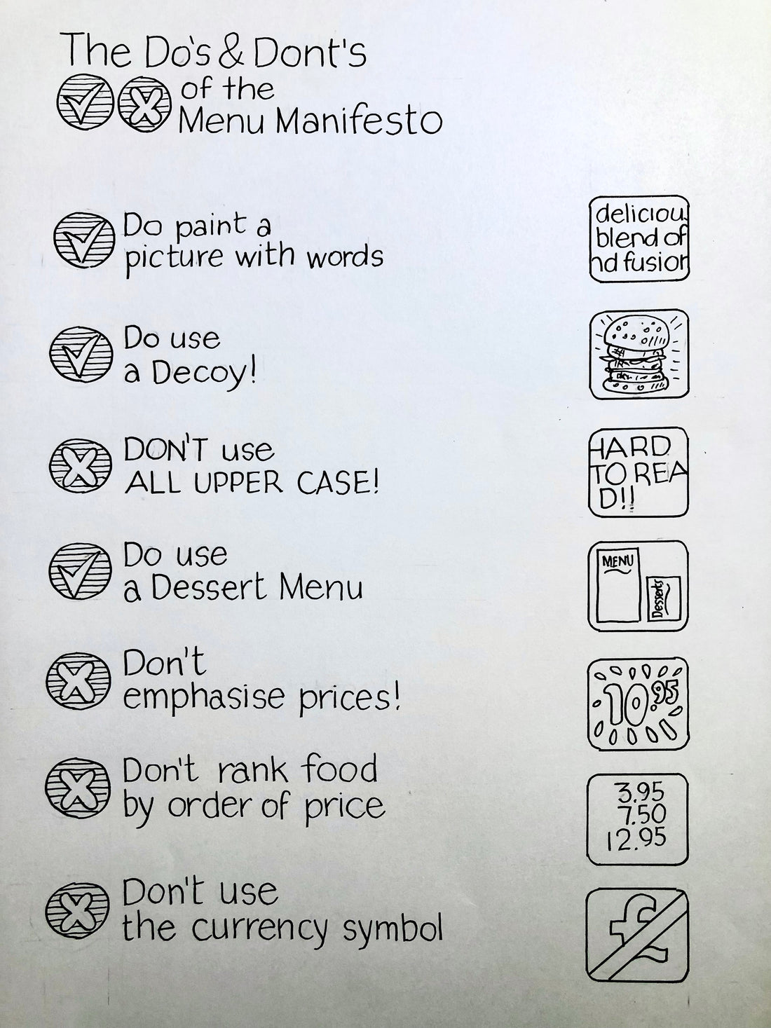
Here are a few things that you should be thinking about when it comes to presenting your menu to your customers.
- Do drop the £ $ € ¥ currency symbol, or whichever is local to you.
- Research students at Cornell University found that people spent less in a cafe when a menu included the $ dollar sign.
- Why? When we see a money sign, we are reminded that we are parting with our money, which triggers negative associations.
- Sound silly? Well, if you agree or not, it is a reasonably easy change to your menu. Look about, lots of people are doing it.
- Do use an anchor or a decoy.
- An anchor sets the price 'tone'. This might be a dish that gives your customers a dish to compare you to other establishments.
- For example, price a simple burger to be the same or nearly the same as all the other burgers in your neighbourhood; your guest will view you and the rest of your menus as competitive.
- A decoy works another way. By having something outrageously priced on the menu, twice or three times the price of everything else ...everything else on the menu, by comparison, looks like good value. Having a triple Gold Rush burger at £35 sets a high bar but then a burger for £15
- Do you want to sell desserts?
- Really? There is a good margin in desserts if it's your thing.
- OK then, please, please list your desserts on the same menu as your starters and main courses. If you are serious about desserts, give them their own menu.
- Think about it; if you get a menu that has starters, main courses and desserts, there is a danger that the guest will choose between one or the other. Imagine thinking this: "Oh, I like the look of the garlic prawns, but I really love the fresh trifle here... hmmm ... I'll not have the prawns today and just have the trifle. If you have a menu with just starters and mains, the customer cannot see the puddings or desserts; they will not have that mental tussle. They may not have a pudding when you ask, but you have not stopped the starter right at the beginning.
- Separate dessert menus are worth spending the money on! You'll get a return.
- Do use pictures - with words at least!
- Yes, good photos sell food. All those cookbooks with amazing photos? All those fast food places with electronic menus and fantastic food shots? Restaurants on Instagram
- Great photos may not be your thing or your budget, but an engaging, illustrative description of the dish you are listing goes such a long way.
- Think about this:
- 'Cheese Cake - vanilla cream cheese and biscuit base
- V
- 'Spruce Pond Inn's Classic Vanilla Cheese Cake - our classic recipe that we've been serving since we opened in 1955. Thick creamy vanilla filling on a crunchy biscuit base. Classically delicious.
- These can be the same item, but the second one will sell more. This is the same for desserts, soups and anything else on your menu.
- Don't overuse UPPER CASE CHARACTERS.
- It's OK for TITLES, BUT IF YOU START USING IN DESCRIPTIONS OR INGREDIENTS, IT BECOMES REALLY HARD TO READ. The whole reason behind the upper and lower case is about making things easy to read.
- Don't use a font that only has upper case everywhere; you might like it, but can anyone read it?
- Don't emphasise prices………………………………………………….$19.00
- If they are already in the restaurant, they have decided to spend money.
- Presumably, you do not want everyone to buy the cheapest items on the menu.
- Presumably, you want them to buy something they are going to enjoy.
- Earlier, we said to use descriptions to sell your food. You need your guests to read the descriptions with an open mind.
- Do your business a favour and stop highlighting the prices. If you highlight the prices, your customers will read the prices and then choose.
- Surely it's better to get them to make a choice based on the food on offer then read the price. At least give your menu a chance of selling the right things.
- So don't make your price font a different colour or size.
- Don't do bold, italic or underlined or, worst of all, have those neat tiny dots leading to the prices along the right-hand side of the page………£22
- Better to tuck the price in at the end of the dish description. Same font size and colour but right there at the end of the description. Maybe one extra character space, but that's it. €15
- Trust me - we all do it - if the prices are all flush right, we read them first before reading the descriptions.
- Like the one before - don't list items in order of price.
- Lowest to highest or highest to lowest.
- Not often seen in food but often on wine and drinks menus. Again, you encourage decisions on price before the guest has looked at anything else.
- Particularly with wine. If we are not sure what we are buying, most of us will go the lowest price and buy that or the next one up when listed in order like this.
- Do make sure everything is legible.
- These days, most menu design and proofing is done entirely on a monitor, tablet, or even a phone screen. But then it is printed out and used in a room that has deliberately low lighting most of the time.
- More and more of us are wearing specs. If you are doing any of the things above - don't blow it by allowing your menu to be illegible.
- Best to proof your menu to scale in the room it will be used.
Goodness, don't listen to people that say these are tricks to sell more to your customers. The hospitality business is hard enough as it is. You are just setting out your stall to do the best for your business. Nothing here is underhand or designed to trick the customer. Retail companies have been doing these things and similar for years. It's just good business sense.